Your Cart is Empty

STARCH GREEN DESIGN
Starch Green studio is a West London design studio established by artist-designers Kate Fishenden and Jonathan Mercer. We specialise in graphic design for independently minded, local businesses. Our work is thoughtful, has heart and is rooted in our love of typography, traditional graphic crafts, illustration and beautiful ephemera. Our aim is to delight you and your customers, be approachable, good to work with and deliver charming, high quality work at a fair price.
We’d love to talk to you about a new project, naming a new venture, rebranding or refreshing your brand - do get in touch.
MAKE AN ENQUIRY
If you are interested in having a chat about a design assignment drop us a line and we'll get back to you a.s.a.p.
We are based in London W12 and can suggest some good coffee shops in the area to meet up at!
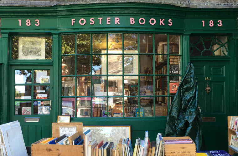
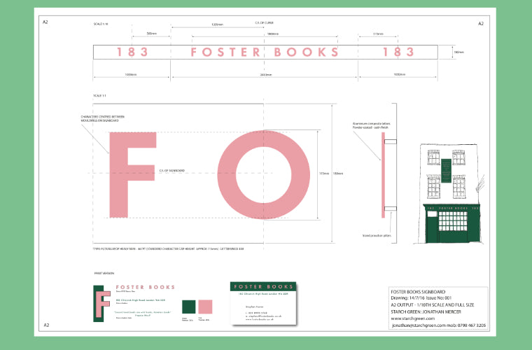
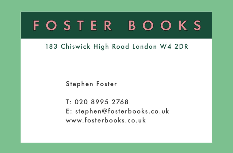
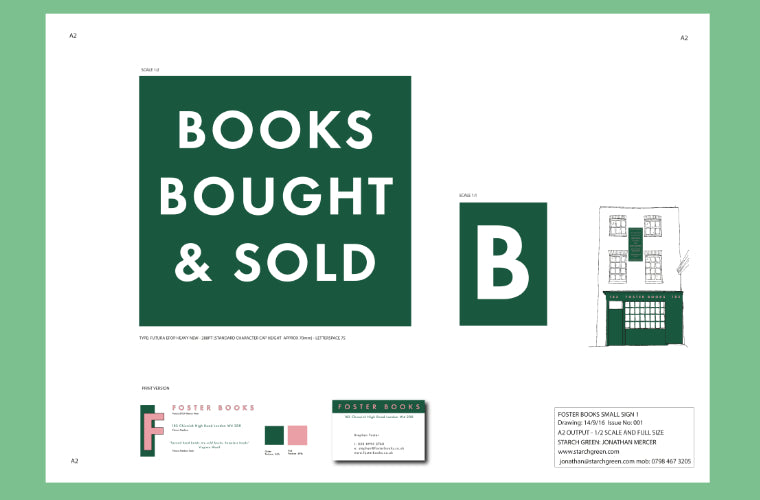
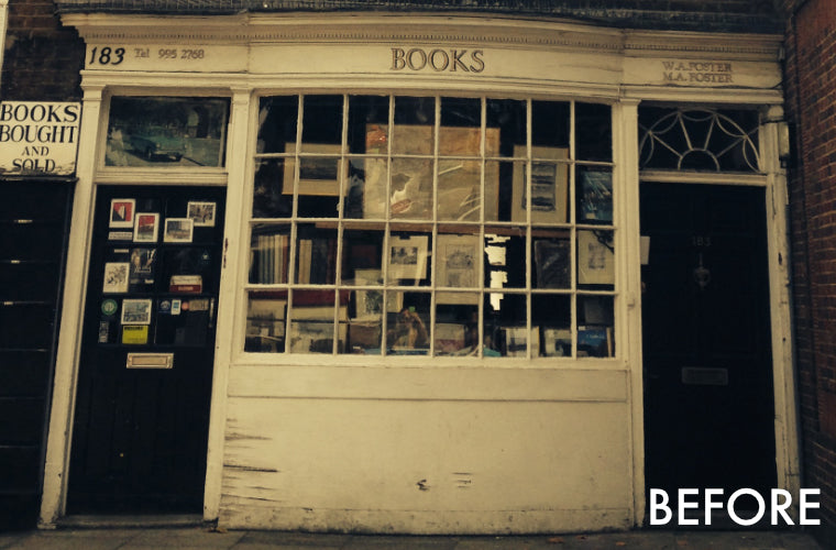
FOSTER BOOKS
Redesign - new identity, shop front, positioning.
Working with a Chiswick character is a joy! Stephen Foster, the proprietor of Foster Books asked us to develop a new shop front for the store on Chiswick High Road. Stephen took over the business from his late father, who established it in 1969, and the whole family take part in running the shop. Working with Stephen, and his partner, Sarah, we worked sensitively introducing ideas to restore the Georgian facade and make it feel even more grounded, intriguing and welcoming. We designed the new fascia, colour scheme, visual identity and business card. We worked on a new positioning for the shop - enhancing the Foster’s love of second hand and first edition books - 'Foster the love of books'.


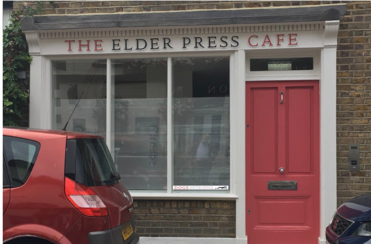
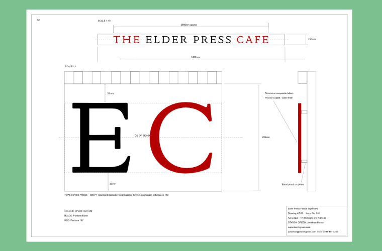
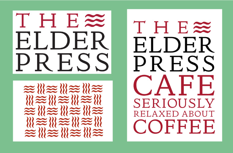
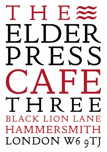
THE ELDER PRESS CAFE
Brand strategy, name, visual identity, design suite, website, signage, customer communications.
When we met Lindsay Elder we were excited and inspired by her plans for a new cafe rooted in the local community. Our brief was to develop the brand strategy, name and visual identity.
Lindsay is a great client, and was very clear about the direction she wanted to take when we presented name ideas and concept areas. We designed a full visual identity including fascia, logo, menus, business cards, loyalty cards, website and signage.
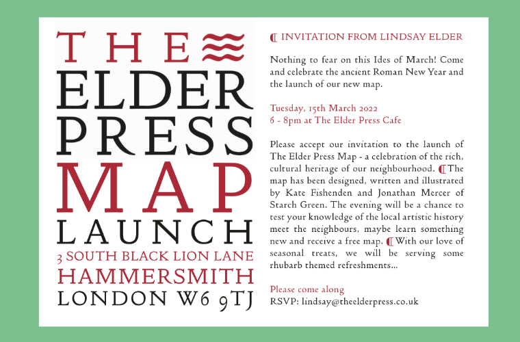
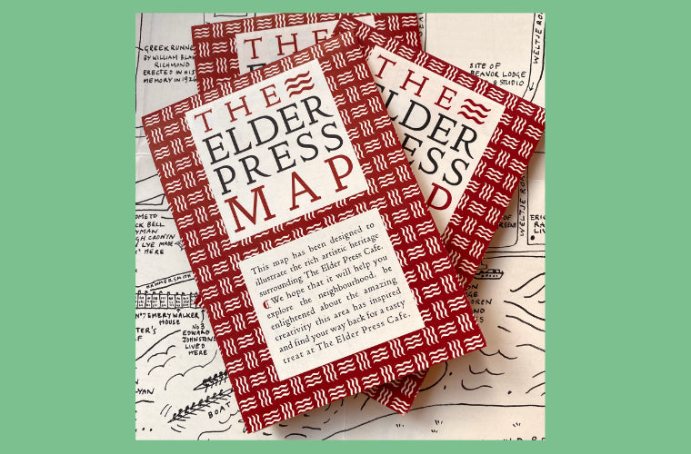
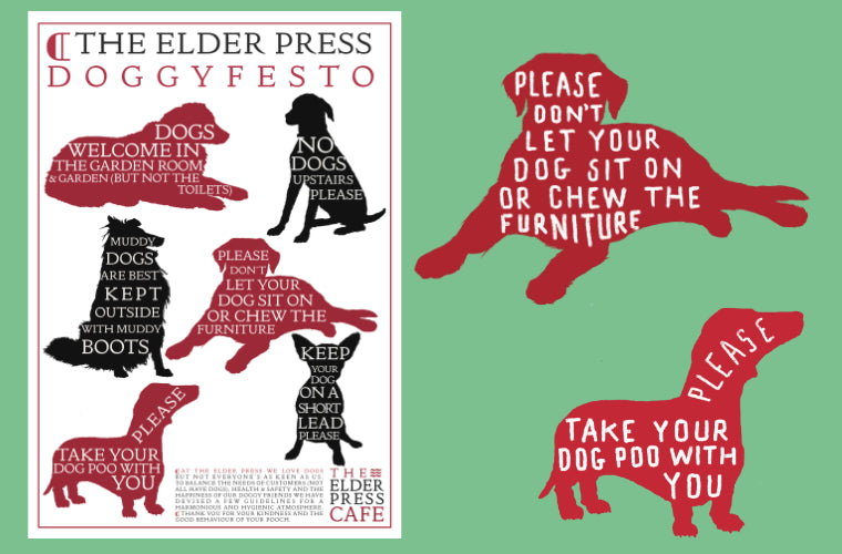
The cafe opened in September 2019 and has gone from strength to strength, surviving the pandemic and serving the best cafe food in West London. Since the launch we have continued to work closely with Lindsay, keeping the brand identity on track, refreshing the website, designing The Elder Press Map, developing the Doggyfesto and creating, writing and publishing the monthly newsletter.


THE ELDER PRESS CAFE
Read more
In the April of 2019 we received a short email entitled ‘Branding’ and enquiring if we would like to work on a new cafe project. Well, yes!
We met Lindsay Elder as soon as we’d returned from our annual trip to Dartmoor and were excited and inspired by her plans for a new cafe rooted in the local community. Our brief was to develop the brand strategy, name and visual identity...
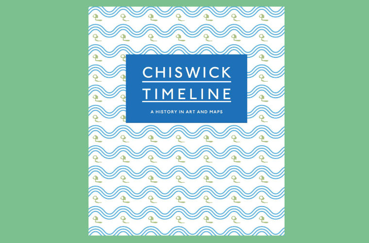
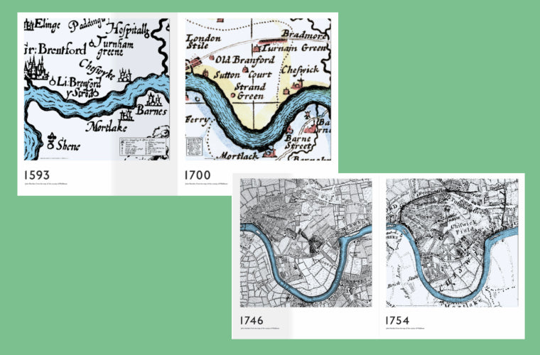
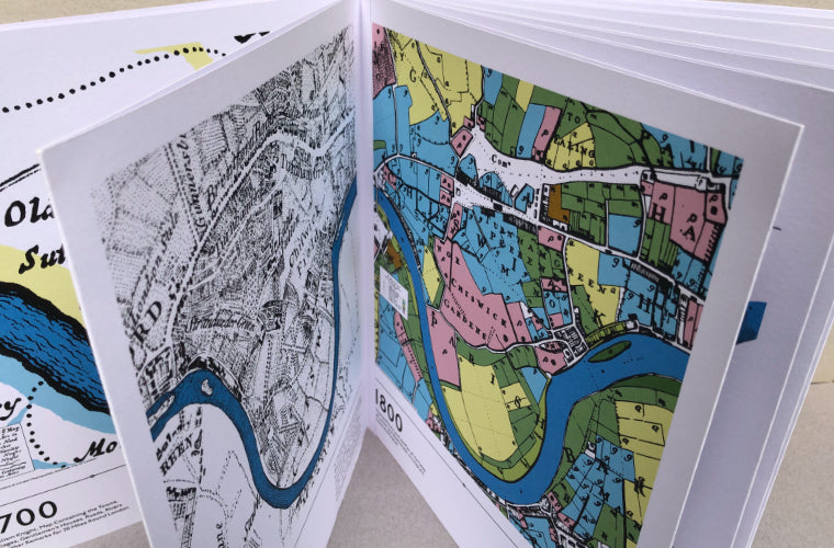
THE CHISWICK TIMELINE BOOK
Book design.
Two of our favourite, and most active, Chiswick residents, Karen Liebreich and Sarah Cruz, had a great idea for cheering up the rather damp and grim walls under the railway bridge next to Turnham Green Station - a mural. The mural is a set of maps dating from 1593 to 2018 all showing the same part of the Thames running through Chiswick. On each section is shown an artwork that relates to the period of the map, by an artist working or living in the area.
We were briefed to create a memento for the launch of the completed mural (I won’t go into the trials and tribulations, nay pain, that was involved for Karen and Sarah to get there). We looked at various interesting formats and sizes and decided on a concertina book that showed every panel of the mural with history and details on the back of each page. The cover design reflects the riverside location and uses a tiny tree symbol from one of the maps. Transport for London part-funded and allowed the siting of the mural, so it seemed appropriate (and lovely) to use their typeface, Johnston - designed by local resident Edward Johnston in 1913. A copy of the book was given to every school in Chiswick and the limited edition was sold to raise funds for the mural.


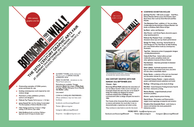
BOUNCING OFF THE WALL!
Visual identity, posters, customer communications.
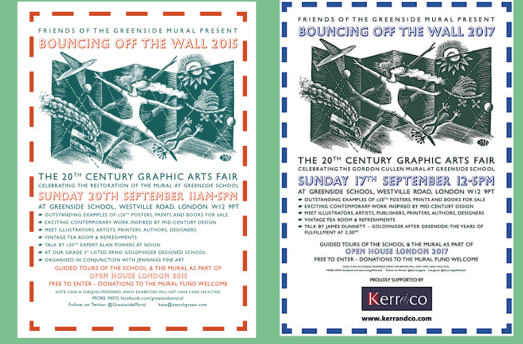
Having spotted an extraordinary mural in Greenside Primary School that had been covered by a mysterious red velvet curtain for 20 years, Kate started on a mission to find out more about it. It was commissioned by Erno Goldfinger, the designer of the school, and painted in 1952 by Gordon Cullen. The campaign to raise funds to restore the mural gave rise to an awful lot of work organising things for Kate and Jonathan, but also a series of poster designs.
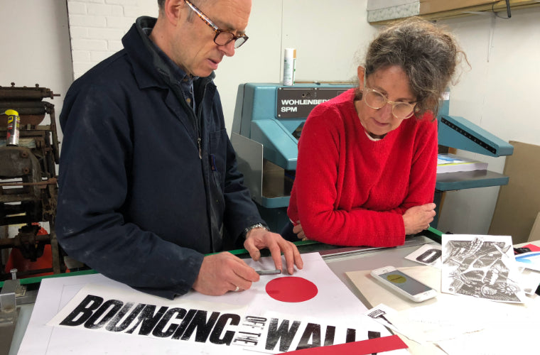
Firstly a series of posters for the Greenside Lectures, talks on Hammersmith artists to kick off the fundraising campaign. Secondly, communications for the first Bouncing Off the Wall! C20th Graphic Arts Fair in 2014 - to launch the restored mural with a ribbon cutting by Cullen’s widow, Jacqueline and a fabulous array of artists, illustrators, publishers and art dealers. We designed all the publicity and created a letterpress poster with Helen Ingham at CSM using a specially made wood engraving and borders by Jonathan and hand set type. We continued with the design though fairs in 2015 - 2017.
Come 2018 we designed a new visual identity working with Phil Abel and Hand & Eye Press to create a constructivist-inspired letterpress poster, again using hand-set type and strong graphic elements. This was the basis for the design of posters and flyers for the fair.